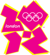
 With the well-publicized logo disasters of the 2012 London Olympics and, most recently, the Gap, there are lessons to learn about what not to do – particularly when it comes to fonts. With thousands of fonts at your fingertips, lesson number one is to proceed with caution.
Brainy Best Practices
The scientific team at the neuromarketing company NeuroFocus reviewed the Gap logo against what they call “neurological best practices.” Here are a couple of ways the revised Gap logo misses the mark:
 • High/Low Contrast: The original white “GAP” logo provides high contrast against the dark blue background. The white letters “pop.” Neurological research has shown that the brain likes “pop-outs.”
![]() • Too Sharp: The brain dislikes and tends to avoid sharp edges. With the new Gap logo, the box image cuts into the letter “P,” so the brain doesn’t “see” that letter.
• Too Sharp: The brain dislikes and tends to avoid sharp edges. With the new Gap logo, the box image cuts into the letter “P,” so the brain doesn’t “see” that letter.
 Perhaps an even better example is the 2012 London Olympics logo. Here, the logo – entirely created by a font spelling out “2012” – is nothing but sharp edges. It, too, has sparked a strong negative reaction.
Interesting Fonts Can Work
Whether you’re creating identity materials, a brochure, direct mailer or newsletter, the font will play a role in how it engages readers.
In the case of the original Gap logo, the font was interesting enough that it appealed to the brain and could be easily recalled from the clutter of other corporate logos. But, you can take it too far. Although the Olympic logo font is interesting and creative, it is so different that the year is unrecognizable.
As both logo missteps have shown, even world-class organizations make mistakes. And, it’s doubly true of smaller businesses. Let the graphic design experts at Allegra help you get it right.


